Creating a landing page is easy. Creating a landing page that truly converts… that's another story.
Whether you're working on an Ads campaign, a lead magnet, or a product launch, your landing page is often the decisive point between "interested" and "customer." Yet many landing pages miss the essentials: a clear message, a well-thought-out structure, and conversion-focused choices.
In this article, we'll explore together how to optimize a landing page that truly converts your visitors into leads or customers, with concrete tips, smart tools, and mistakes to avoid. No theoretical fluff — just practical, actionable advice to improve your performance.
How to Optimize a Landing Page That Truly Converts?
Understanding the Strategic Importance of a Landing Page in B2B
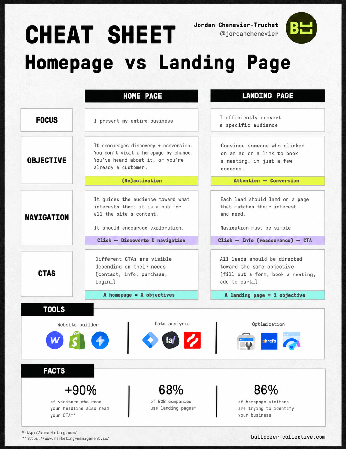
A Landing Page Is Not a Homepage
A common mistake: confusing the landing page with the homepage. Yet they have nothing in common.
The homepage welcomes everyone and offers multiple paths. The landing page follows the opposite logic: one message, one goal, one action.
No menu, no distractions: everything is designed to guide the user toward a single choice. That's the key to a good page.
A Page Adapted to the B2B Journey
In B2B, decisions are slower and more deliberate — but that doesn't mean you need a complicated page.
A good landing page takes into account where your lead is in the funnel:
Top of funnel? Inform, reassure.
Bottom of funnel? Drive action (demo, call...).
A Direct Impact on Your ROI
A well-designed landing page means concrete ROI. And often, it's what makes all the difference between an average campaign and one that crushes it.
The Pillars of a High-Performing Landing Page
Structure and Design in Service of Action
A benefit-oriented headline: it should speak to the user's problem, not about you.
One message, one offer: one page = one promise = one action.
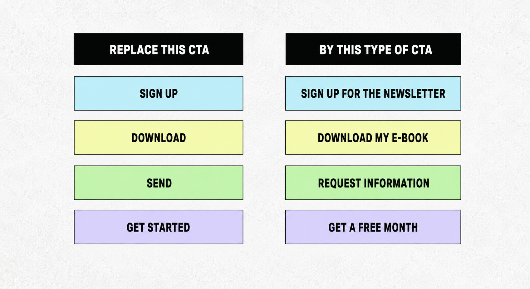
A visible, clear CTA: it must stand out, be compelling, and be well-placed (top + bottom of page).
A well-calibrated form: enough info to qualify, but not too much to deter.
Copywriting: Writing to Convince
Speak to your persona: address them, in their language, and show that you understand their challenges.
Play on emotion and action: curiosity, frustration, gain, relief… These are powerful levers, even in a professional context.
Create urgency, without pressure: a limited offer, one spot left, or a deadline can tip an undecided visitor.
Anticipate objections: price, credibility, effectiveness… Better to address them directly on the page.
Tutorial: Build a Conversion-Focused Landing Page, Step by Step
🧱 Step 1 – Define a single marketing objective
Your page must respond to one conversion goal: lead magnet download, webinar sign-up, meeting booking, or demo request.
👉 One funnel = one landing = one call to action.
🧠 Step 2 – Target your B2B persona
What are their pain points?
What solution are they looking for?
What immediate benefit can make them click?
📝 Step 3 – Structure the copywriting of your page
A high-perceived-value headline
A subtitle clarifying the offer
Benefit-oriented bullet points
An impactful CTA
A reassurance section (social proof, figures, reviews)
🎨 Step 4 – Use a no-code builder
Unbounce for advanced A/B testing
Landingi for simplicity and speed
HubSpot if your CRM centralizes your lead pipeline
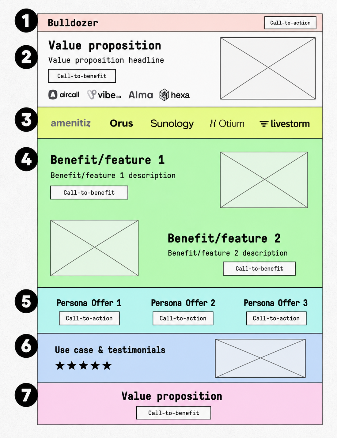
📲 Step 5 – Organize your conversion page
Headline + subtitle
Illustrative visual (mockup, video)
Bullet points
First CTA
Client testimonials / logos
Second CTA
Lead-gen form
🧪 Step 6 – Launch a first A/B test
Headline (emotional hook vs. direct benefit)
CTA (action vs. value)
Main visual
🎯 Step 7 – Connect your acquisition tools
Verify lead routing to your CRM (HubSpot, Pipedrive, etc.)
Integrate Google Analytics 4 and Hotjar for behavioral tracking
Activate your email automation workflow if needed
There you go. In 7 steps, you have a clean, clear, targeted landing page ready to capture your most qualified leads.
[rta-block=folder-cta][rta-title=h3]Want to learn more about your CRO potential?[rta-title=h3][rta-btn=regular href="/prendre-rendez-vous-typeform" target=_blank]Get a free audit[rta-btn=regular][rta-block=folder-cta]
Boosting Trust and Reassuring the User
Client testimonials and logos: a clear sentence from a satisfied client + a recognized logo = instant credibility.
Hard data: nothing more reassuring than concrete results. Example: "+ 42% meeting bookings in 2 weeks" > "Incredible results".
Press mentions and labels: certifications, articles, sector awards… Anything that shows you're recognized builds trust.
In short: social proof is your best ally for removing the last barriers to action.
Optimizing Your Landing Page with Tools and Tests
A/B testing: change one thing at a time (headline, CTA, visual, form). It's often the small adjustments that make the biggest difference.
Heatmaps and scroll maps: tools like Hotjar or Clarity show where people click, pause… or drop off.
Dynamic personalization: adapt the content based on source, sector, or keyword. A tailored message always converts better.
Localization: in international B2B, offering the right language or local references creates a real connection.
Recommended Tools and Integrations
Unbounce: highly customizable, perfect for A/B tests.
HubSpot: ideal if you already use their CRM, everything is integrated.
Landingi: simple and effective for SMBs.
Landing page examples by funnel stage
Discovery: a webinar or guide sign-up page. Goal: capture interest, generate a cold lead.
Consideration: a landing for meeting or demo booking. The visitor is already interested, they want to dig deeper.
Decision: a limited offer or specific pricing. Here, you need to reassure, prove, and give one last good reason to go for it.
What Kills Conversion (and How to Avoid It)
The Most Common Landing Page Mistakes
Too many elements kills action: useless links, superfluous sections, endless text… Every distraction drops your conversion rate.
Unclear message, cluttered design: if the offer isn't understood within 5 seconds, it's lost.
No social proof, no testing: without testimonials, without logos, without A/B tests, you're flying blind.
The Real Optimizations That Boost Conversion
Emotional copywriting: touch your prospects' frustrations or desires. Talk benefits, not features.
Context-adaptive pages: personalizing the message based on source or device increases impact.
Good SEO without sacrificing action: use a coherent vocabulary, but keep the focus on the CTA.
Case Study: What Does It Look Like in Practice?
Take the case of Comptables.com, a marketplace launched by the Morgan Philips group. The strategy Bulldozer put in place combined targeted multichannel campaigns, A/B testing of landing pages, and deployment on innovative channels like SMS.
Comptables.comachieved a 45% conversion rate on its best landing page and more than 300 account creations.
Creating a landing page is not just "putting a form on a pretty image." It's a real balancing act between design, content, user psychology, and technical performance.
A good landing page is one you test, adjust, and evolve. Your page must guide your visitor, without friction, toward a specific action — while addressing their doubts and speaking their language.
What is a good conversion rate for a landing page?
A good conversion rate depends on the sector, the traffic, and visitor intent. In general, a rate of 10% or more is often considered high-performing for a well-optimized landing page, but the main goal remains to increase this rate relative to your current situation.
Which elements of a landing page have the most impact on conversion rate?
The most influential elements are a clear value proposition, a punchy headline, an attractive offer, social proof (testimonials, client logos), a simple layout, and a visible call-to-action. All of them must intuitively guide the visitor toward the desired action.
Should you run A/B tests to improve a landing page?
Yes. A/B tests let you compare two versions of a page to identify which one converts best. Without testing, it's hard to know what actually works rather than just a hypothesis.
Is visual design more important than the message?
Design is important, but it must serve the message. A landing page can be visually polished yet ineffective if the message isn't clear or relevant. The impact is greatest when the main message emerges immediately and the design highlights it without distracting.
How do you measure the effect of optimizations on a landing page?
You use analytics tools that track actual conversions (for example a completed form, a purchase, a sign-up) as well as behavioral metrics such as time spent, button clicks, or scroll depth. This makes it possible to know precisely which changes improve or degrade the conversion rate.
Newsletter
Join those who are redefining AI-driven growth.
Get access to playbooks and feedback from those who are shaping the next wave of marketing and AI.
Thank you! Your submission has been received!
Oops! Something went wrong while submitting the form.

.jpeg)