
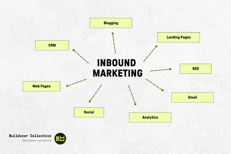
Your landing page is getting traffic… but nobody's clicking? Don't panic. Turning visitors into customers sometimes just takes a strong hook, a clear structure, and a few well-placed adjustments.
In this article, we share examples of successful landing pages, mistakes to avoid, best practices for creation, and concrete tips to increase your conversion rate. Whether you're offering a service, a product, or downloadable content, you'll have all the keys to create an intuitive landing page that's aligned with your objectives and tailored to your personas.
Let's get started!
A landing page is neither a homepage nor a product page. It's a dedicated page that gets straight to the point: triggering a CTA action (sign-up, purchase, download). One main objective, zero distractions, and a structure designed for fast decision-making.
A landing page is a web page designed to get visitors to click a link or a CTA button (e.g.: download a guide, request a demo, buy).
It differs from:
👉 Types of landing pages:
The power of a high-performing landing page lies in the clarity of its objective. Every element — headline, image, button, paragraph — must push the visitor toward a single defined action:
That's it.
Place the CTA above the fold and repeat it at the bottom of the page. Multiple objectives = confusion = fewer conversions. Keep this fundamental principle in mind: every page in a conversion funnel has a well-defined role. The landing page's job is to turn interest into action.
In a marketing funnel, the landing page comes right after acquisition (ads, SEO, email) and right before conversion. It captures attention (good targeting), reassures (proof), then drives action via a well-placed CTA.
Example: running a Meta ad for an e-book? Your landing page doesn't talk about you. It sells the e-book. Full stop.
An effective landing page goes straight to the point: one CTA action and nothing else. Think target audience, fast decision-making, and clear structure. These best practices apply to all types of landing pages (transactional, squeeze page, lead capture page).
Your headline is your first (and sometimes only) chance to hook the visitor. It must immediately express a clear benefit, generate interest, and reflect the uniqueness of your offer.
The 4U method (Useful, Urgent, Unique, Ultra-specific) is deadly effective:
The CTA button is the conversion engine of your page. It must be:
Avoid generic phrases like "Learn more." Be precise, engaging, and above all… make people want to click.
Design should never steal the spotlight from the content. It must:
Good design is the kind that puts your CTA in the right place at the right time.
Before clicking, your visitor needs to be reassured. For this, nothing beats:
What we call social proof is a very powerful lever for overcoming final objections.
This is non-negotiable: your landing page must be mobile-optimized. More than half of visitors arrive on a smartphone. And if it takes more than 3 seconds to load, they're gone.
To do:
A high-performing landing page is also a fast landing page.
Visitors don't care about what your product does — they care about what it can change for them. That's rule #1 of good copywriting.
Instead of:
"Our software manages your multi-channel email campaigns"
Prefer:
"Save 5 hours a week by automating your email campaigns"
Always think in terms of gains, relief, or transformation for your target.
🪤 Magic formula: feature + benefit + proof = maximum impact.
You can't optimize what you don't measure. A/B testing means comparing two versions of the same element to see which converts better. Priority tests:
Test only one element at a time for reliable results. For this, we recommend tools like VWO, AB Tasty, or Convert. VWO also published a great article on this: https://vwo.com/ab-testing/
Sometimes your visitors aren't reading what you think. Heatmaps and scrollmaps show you:
Useful tools: Hotjar, Clarity, or Smartlook.
A first-time visitor has different expectations than a warm prospect. A high-performing landing page can:
The more the page feels like it's speaking directly to the user, the higher the conversion chances.
Before launching campaigns, show your landing page to 3 or 4 people not involved in the project. Ask them:
You'll sometimes get more insights than from 10 hours of analytics.
[rta-block=folder-cta][rta-title=h3]Want to learn more about your CRO potential?[rta-title=h3][rta-btn=regular href="/prendre-rendez-vous-typeform" target=_blank]Get a free audit[rta-btn=regular][rta-block=folder-cta]
The more information you ask for, the more likely you are to lose visitors along the way.
A landing page form should stick to the essentials. In general:
Above all, never ask for information that serves no purpose later. If you need more data, use a two-step form. The first screen qualifies, the second completes.
Your landing page isn't a regular web page. It's a page with a single objective. Every external link and every menu is an exit door.
Avoid:
The fewer paths available, the more the visitor stays on the only path that matters: the conversion path.
A classic mistake: the ad announces one thing, the page delivers another. Result? Immediate loss of trust, bounce rate through the roof.
Common examples:
Consistency between the traffic source (ad, email, link) and the landing page is fundamental. Keep the same promise, the same tone, and if possible the same visual.
A user fills out the form… and the page closes? Major missed opportunity.
The thank you page is essential for:
Without a clear follow-up, you risk losing both your visitor… and your data.
Starting from scratch? These tools let you build a complete landing page without coding, with ready-to-use blocks, conversion-optimized templates, and simple integrations:
These platforms often include A/B testing, automatic responsive design, and basic analytics.
If you prefer to work on your design before integration, or collaborate with a designer, here are ideal resources:
Many conversion-optimized templates are available for free or at low cost.
To track your conversions, automate your marketing actions, and better understand visitor behavior:
Prioritize tools compatible with your CRM to automatically capture leads and track their progression.
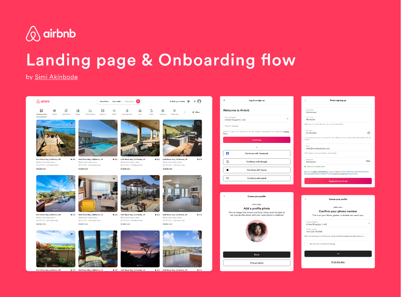
Airbnb's landing page prioritizes user experience above all. Upon arrival:
What works: no friction, a clear promise, and an interaction possible in under 2 seconds.
Dropbox takes "less is more" to the extreme: white background, minimal text, one button. Everything centers on the user benefit:
"Find everything you're looking for. Protect all your content."
The CTA is crystal clear: "Try for free." No excess.
What works: total focus on the action, visual comfort, crystal-clear message.

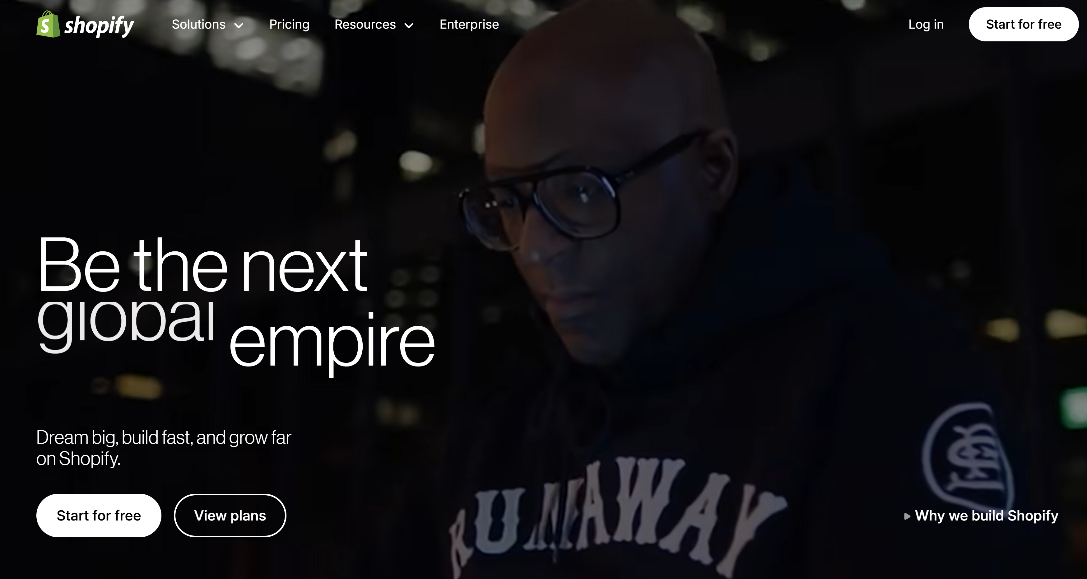
Shopify uses surgical microcopy:
Every word is there to overcome an objection.
What works: trust-building copy, social proof, and conversion-focused structure.
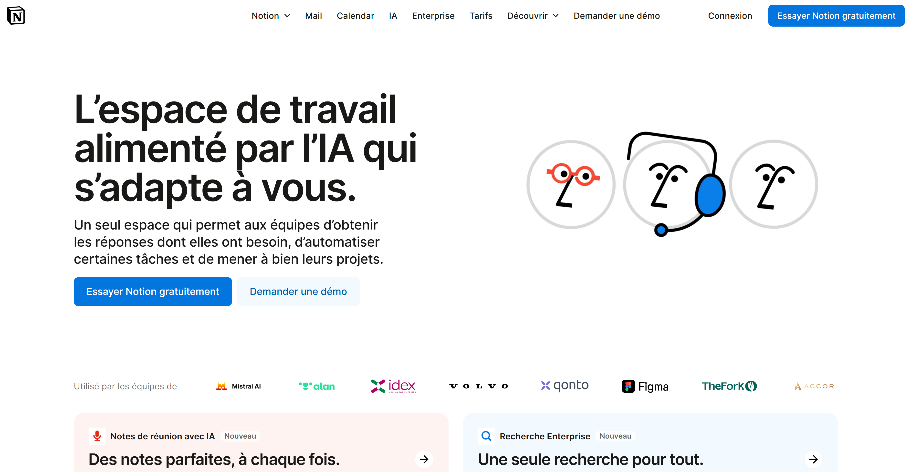
On desktop and mobile alike, Notion's landing page is:
What works: smooth experience, design in service of content, and strategic positioning of action buttons.
These examples show that there's no single magic recipe, but there are common principles:
Draw inspiration from these pages to build your own, but above all: adapt them to your target, your offer, and your acquisition channel.
📌 The 7 golden rules to remember:
🎯 Ready to take action?
Lorem ipsum
.jpeg)
Writer at Bulldozer, he covers web scraping, UGC and no-code, mixing data, storytelling and SEO.
Can't find what you're looking for ? Contact us here
jordan@bulldozer-collective.comGet access to playbooks and feedback from those who are shaping the next wave of marketing and AI.