
Your SaaS solution is solid, but your landing page isn't driving action? It's often a matter of structure, design, and a poorly framed value proposition.
In this article, we walk you through optimizing your SaaS landing page: clean design, a call to action visible above the fold, credibility elements, live demos, and audience segmentation. We share best practices, common mistakes to avoid, and — most importantly — concrete levers to increase your conversion rate and turn every visitor into a potential user.
A SaaS landing page isn't just a pretty showcase. It's a strategic tool designed to trigger a specific action: free trial sign-up, booking a meeting, requesting a demo. In short, it's where marketing turns into conversion.
And when it's well structured, it can make all the difference between a curious visitor and an active customer account.
A SaaS landing page is a section of your site entirely dedicated to a single objective. Unlike a general homepage or a classic "product" page, it doesn't scatter attention:
Page: Homepage
Objective: Navigation, broad discovery
Content: Menus, storytelling, multiple links
Page: Feature page
Objective: Explain a specific feature
Content: Product focus, technical detail
Page: SaaS Landing Page
Objective: Convert on a targeted action
Content: Headline, benefits, CTA, social proof
In a SaaS context, the landing page isn't just a marketing asset. It's the primary touchpoint in your acquisition campaigns (ads, SEO, email, affiliate...).
A good SaaS landing page serves very concrete objectives:
Some typical use cases:
Use case: Product launch
Main objective: Generate a spike in interest
Example: New AI feature
Use case: Post-ad page
Main objective: Maximize acquisition ROI
Example: Google Ads campaign on "simple CRM tool"
Use case: Competitor landing
Main objective: Capture comparison searches
Example: "Hotjar alternative" or "Miro vs Figma"
A common mistake: trying to do everything with a single landing page. Bad idea. To be effective, your page needs to speak to a specific audience, in a specific context, with a calibrated message.
Creating multiple variants lets you:
A good rule: 1 page = 1 promise = 1 audience = 1 CTA.
And if you want to go further: test. Landing page A oriented toward "free trial," page B toward "book a meeting"... A/B testing is king in SaaS.
There's no magic formula, but certain structures work particularly well in SaaS. Why? Because they maximize readability, prioritize information, and guide the user toward action.
Base checklist:
In SaaS, your visuals need to show rather than tell. Your tool is digital? Show it in action.
Here are the three essentials to include:
In an ultra-competitive landscape, reassurance is key. Nobody will take your word for it: your customers need to speak for you.
Here are the formats that work best:
User testimonials
Example:
🗣️
"We cut our customer request management time in half."
— Sarah, Customer Success Manager at Acme
Trustpilot, G2, Capterra, AppSumo, Chrome Web Store… Ratings must be real and verifiable.
Tip: place social proof right after the value proposition, and right before each CTA. That's where it has the most impact.

Today, users have seen dozens of SaaS landing pages. To capture their attention and maximize conversions, you need to differentiate smartly. Not by adding noise, but by creating a clear, engaging, contextual experience. Here are the "twists" that really make the difference in 2025.
Some UX mechanics have become standards among the best-performing SaaS products. They combine interactivity, reassurance, and journey fluidity.
1. Interactive scenarios & product tours
Instead of simple descriptive text, offer a guided experience.
Examples:
Benefits:
2. Built-in comparison table (vs. competitor)
Effective format:
Feature: French language support
Your SaaS: ✅
Competitor A: ❌
Feature: Open API
Your SaaS: ✅
Competitor A: ✅
Feature: Monthly price
Your SaaS: €19/month
Competitor A: €49/month
Pro tip: place a CTA right below the table: "Try free for 14 days"
3. Dual user journey
Not everyone is ready to test right away.
Offer two clear paths:
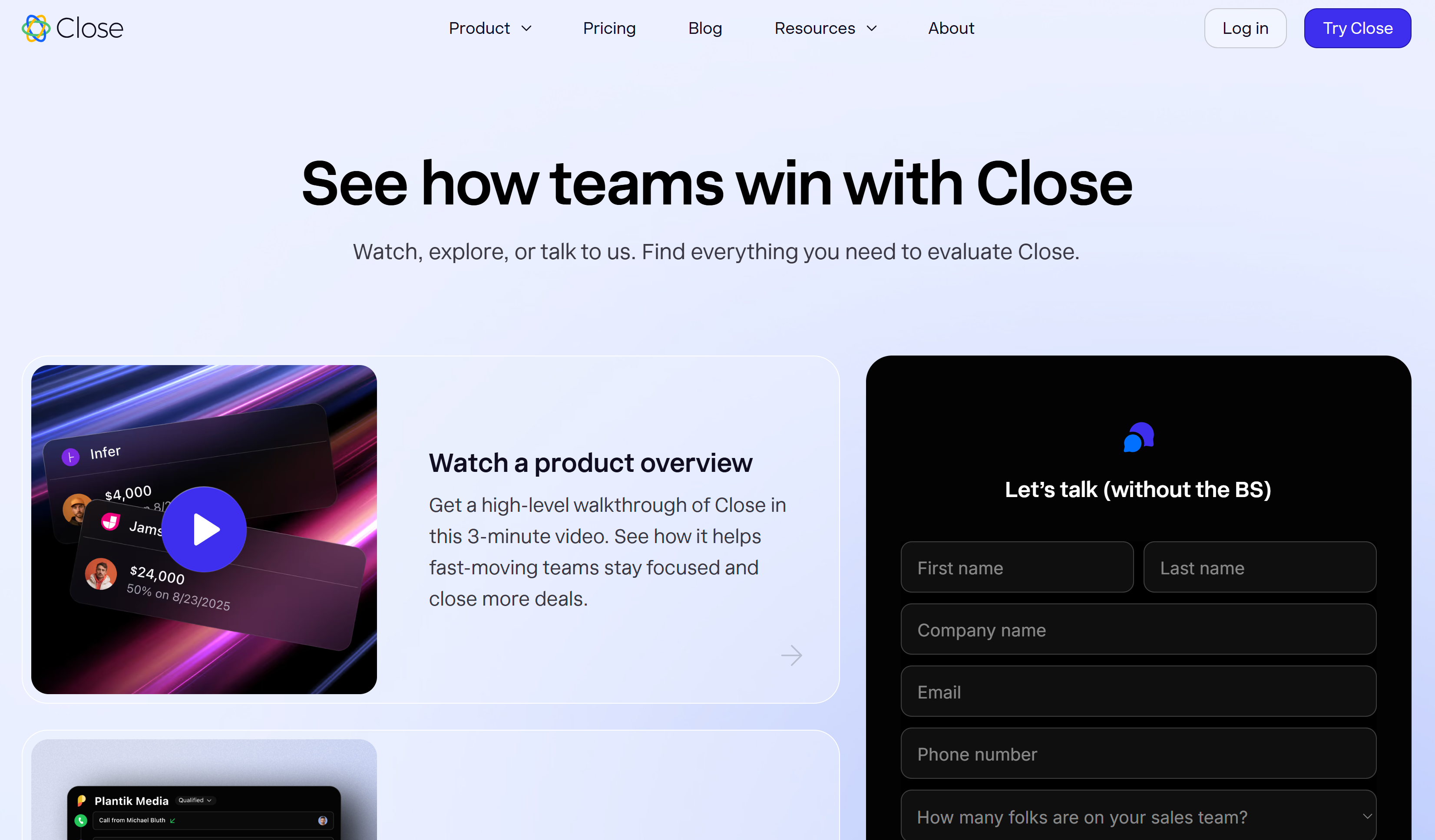
Example: Close CRM offers both options on the same landing page, without overwhelming visitors.
This adapts to the prospect's level of readiness: some want to explore on their own, others need to talk before committing.
A generic landing page reaches everyone… so it reaches no one. The key in 2025 is fine-grained targeting, at every level: team, sector, company size.
1. Use cases by team
Adapt your message to the day-to-day realities of each team. Examples:
Suggested structure:
👉 A section "How our tool helps…"
+ 3 visual blocks: one per team
+ Contextual CTA below each block
2. Messages by company type
Don't talk to a startup the same way you'd talk to an SMB or an enterprise.
You can create different landing page variants for each profile — or integrate dynamic content blocks using tools like Mutiny, Unless, or Webflow Logic.
[rta-block=folder-cta][rta-title=h3]Want to learn more about your CRO potential?[rta-title=h3][rta-btn=regular]Get a Free Audit[rta-btn=regular][rta-block=folder-cta]
A high-performing landing page is good. But a landing page strategically designed to increase conversion rate is better. At Bulldozer, we go far beyond simple design: we think user experience, behavioral data, and complete workflow, from the first visit through to sign-up.
We combine clean design, tracking tools, and digital marketing to optimize every step of the user journey. The goal is clear: convert as many visitors as possible into active customer accounts.
Here are the building blocks we systematically integrate:
We never send a prospect to a "silent" page. Every click is an opportunity to personalize the funnel.
Not everyone is ready to buy. Sometimes you need to create a softer engagement hook. That's where a well-designed "bonus" can make all the difference.
Our favorite formats:
And to facilitate immediate engagement:
A standalone landing page is no longer enough. It needs to fit into a smooth, global strategy. Here are the points we systematically synchronize:
The goal isn't just to convert more, but to build a funnel that turns every click into a measurable business opportunity.
The takeaway: no need to say too much. The product experience speaks for itself, especially when it's well presented.
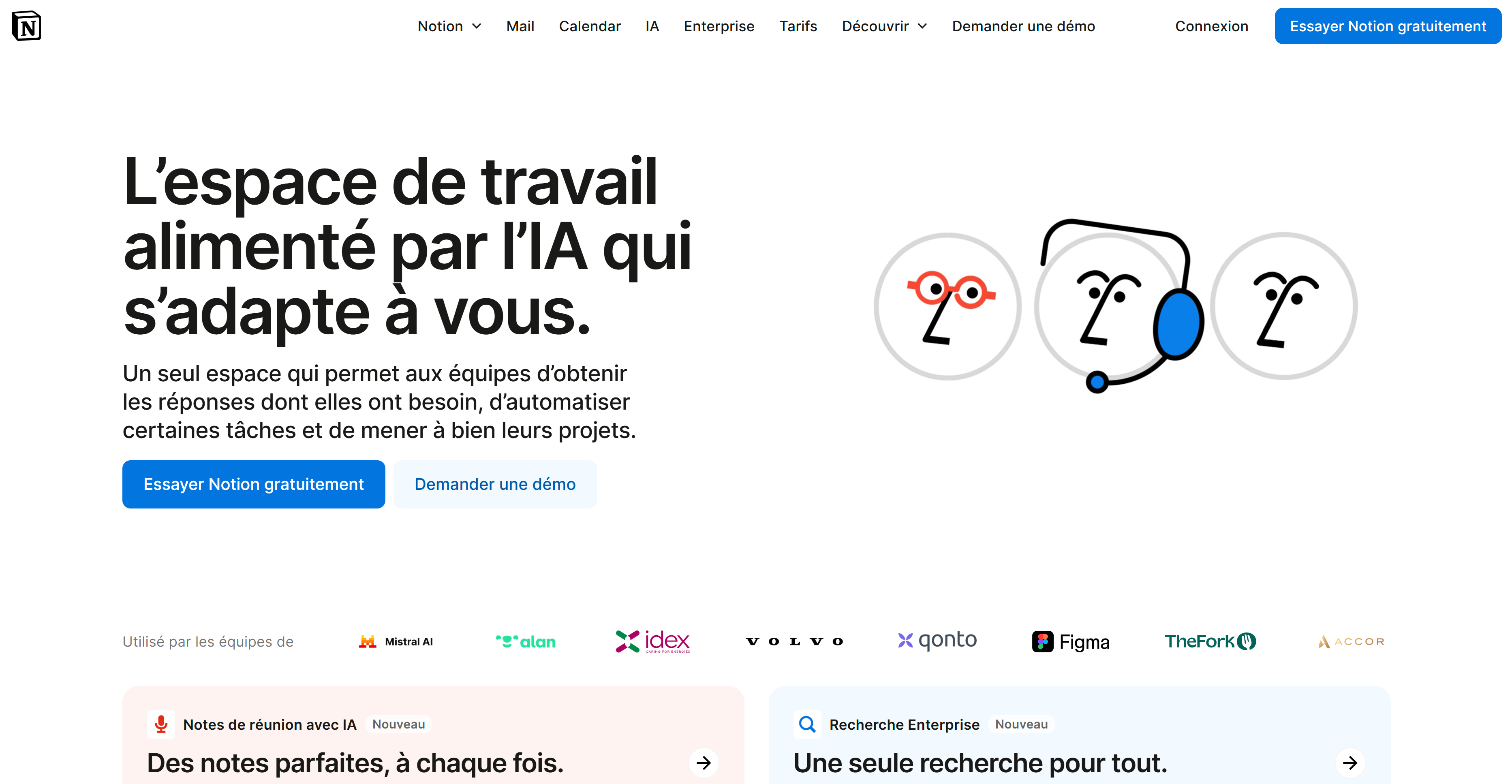
Why it works:
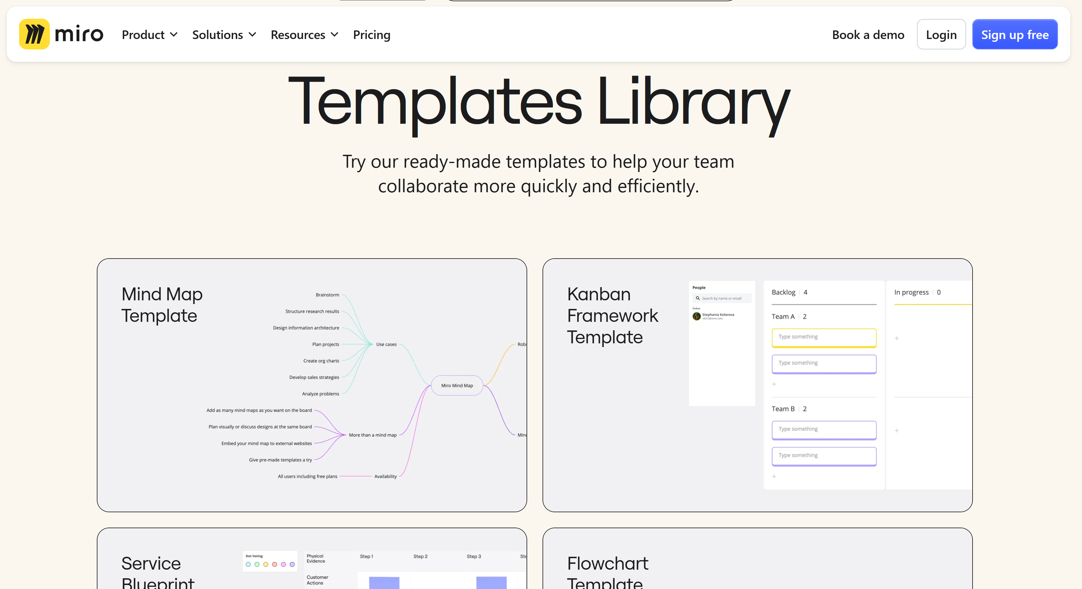
Key takeaway: a landing page isn't just an entry point. It's already the beginning of the funnel.
Every high-performing page actually follows the same structural principles. Here's a framework you can apply to your own project:
Element: Benefit-focused headline
Why it works? You capture in 3 seconds what the tool changes for me
Adapt for you? Yes, always
Element: Product demo visible quickly
Why it works? Skip the pitch, show the value directly
Adapt for you? Yes, especially for UI-driven tools
Element: High-contrast, recurring CTA
Why it works? Never leave the visitor without a clear option
Adapt for you? Yes, at least 2 per page
Element: Social proof (logos, ratings, testimonials)
Why it works? Immediately reassures on reliability
Adapt for you? Crucial if you're targeting B2B
Element: Contextualized sections
Why it works? You speak to each user type in their own language
Adapt for you? Yes, as soon as you have multiple personas
You have the keys. Ready to put them into action?
Reach out and let's co-build a SaaS landing page that actually converts.
.jpeg)
Lorem
Can't find what you're looking for ? Contact us here
jordan@bulldozer-collective.comGet access to playbooks and feedback from those who are shaping the next wave of marketing and AI.


Lorem ipsum dolor sit amet, consectetur adipiscing elit. Suspendisse varius enim in eros elementum tristique. Duis cursus, mi quis viverra ornare, eros dolor interdum nulla, ut commodo diam libero vitae erat. Aenean faucibus nibh et justo cursus id rutrum lorem imperdiet. Nunc ut sem vitae risus tristique posuere.